Riker Mounts
-how to use them to easily high-light your collection.
Riker mounts are the easiest possible way to protect and show-off
your collection of smallish items. Simple elegant boxes, -padded
inside and with a tempered glass window.
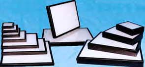
Turns out the Riker Mounts got their start about 70 years ago. They were originally made for butterflies. Used for everything else too. You will find them sold all over the net, and often by companies that also sell the where-with-all to store and display jewelry. (None of them do it with wood like we do, however.)
What they is, is -is essentially a nice flat cardboard box with a window in the lid. They come in a wide variety of sizes, from the small end of about 3" x 4" x 3/4" thick, to a large of 14" x 20" x 2" high. It's not card-board actually, it's high quality press board or chip-board lined with a generous layer of poly-fill batting.* The lid is a simple frame inset with a pane of tempered glass. It's all covered with nice black paper. Long pins at each corner hold the lid in place. It sounds cheap as I describe it, but they are really an elegant little product. And the are MADE IN AMERICA -North Carolina actually.
What is most impressive about them is that they make whatever goes into them look valuable. Or at least collectable. Let me rephrase this. If you have something that you value -for whatever reason- and you carefully tuck it into a Riker Mount -you will not only protect it, you will also show the rest of the world -or at least your spouse- just how valuable it really is!
Now a large part of the appeal of Rikers is that they are simple and straight forward. You open them -arrange your stuff, and close them up again and you are done. But this hardly does everything your stuff deserves. How about a label or two? If you are reading this article, you must be doing so on a computer. Your computer has a printer and you must have soft ware that can print out all manner words with boxes and arrows and what-not in about a hundred different fonts.
And don't skimp on the details. If you are going to the trouble of putting it in a Riker -you will presumably expect it to be around years and years from now. And let's face it, memories fail after years and years. Add a few details.
It is of course a matter of taste, but a little decoration goes a long way. If you poke around in your clip-art files or the "Shapes" command -probably some where at the bottom of your work-processing screen- you will find all sorts of possibilities. Use something appropriate to your collection.
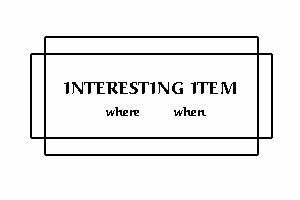
Look at the sample -what could be simpler then two rectangles around the legend? Yet it has a vaguely Art-Nuevo feel. Your old Girl / Boy Scout Badges? Something rustic -logs or arrow heads. Political Buttons? Find a piece of clip-art of an elephant and a mule to clarify who's who in your collection. I'd be very hesitant about throwing lots of color in without a good reason. Unless your kids are doing it. Kids like color -and that's part of the charm. Let them have-at-it.
The very simplicity of Riker mounts and their use makes it just the least little bit challenging to come up with advice on how to use them. But as it is -it's a challenge I'm up for. Let us ponder appealing arrangement and do so from the view of a designer or artist -more specifically, the art director in charge of designing a page of advertising in an expensive magazine. (You see good design every day -one hopes- and good design is so ubiquitous as to be invisible. This is to say that you notice "layout" only when it's bad.)
Our art director would tell us from the get-go that the best thing to put on a page is lots and lots of white space. He or she might fail to mention that this makes for expensive, but he's right. If you have something that is really valuable -or you want it to seem so, put it in it's own large Riker mount in the middle of lots of white space. This means you buy more and bigger mounts, but whad-ya'gonna'do?
Suppose you have two items -symmetry is our friend. Side-by-side or above & below. This is obvious. You say you want an example of pure symmetry from the real world? How about architecture?

Then there is what they call dynamic symmetry -sort of uneven balance that the eye likes anyway. You might actually have to look at this sort of thing twice to notice that is is not actually symmetric.

If you are particularly astute, you may have noticed the tree drawn in on the right and the greater detail of the lower right window where they balance the gable on the upper left.
Give some assorted things to a child and the child will arrange them instinctively. You give the child four things, he will use each corner. If you give the kid 9, 16, or 25 things, (3, 4, or 5 squared), -and if the child is of a mathematic bent- they will discover the square grid. And while on mathematical bent, you can lay things out in a rectangular grid -unless you have a prime number of items. This is not to say the grid will be very attractive. Fr'instance -for lots of numbers -if you wanted a perfectly symmetrical arrangement -you would have to lay-out a 2 by something grid -and this is not terribly interesting. Furthermore, Riker mounts are not made as long and narrow as they would need to be for two rows of something.
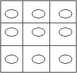
All this is obvious and you are justifiably wondering why I am bothering you with the math. I do so because you will not always collect things in squared or attractive non-prime numbers. So what do do? Go ahead and use a grid anyway and "merge cells." By this I mean to start with a grid, and them combine the little squares to the point you have the number you need. What to do with the new -larger- spaces? If your collection comes in different sizes, this is easy. You simply put the big ones in bigger cells. On the other hand -if all the items in your collection are the same size but one is more important, put the important one in a larger box. Or use a square for a label.
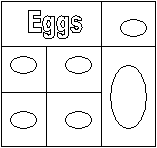
If you doubt the value of such a strategy, look closely at the ads in big magazines. You will find that everything -headlines, pictures, and copy is laid out on a grid and is done so with frightening insight to how the human mind and eye works. The underlying grid may not be obvious, but it is there. Furthermore -notice how you feel when you need to turn the magazine this way and that to read the type. Irritates me, but I am old and cranky.
Don't forget the label -particularly if you have one or two blank spaces, or need to make it appear that one item is sufficiently important to deserve its own larger cells.
Having set aside mathematics, I will take up HS biology. You may remember the idea that many animals -humans included -are laid-out with "bi-lateral symmetry." Same on both sides. Your right hand is a mirror images you your left hand. Why DO I bother you with such obvious things? Because I want to remind you of radial symmetry. This is how starfish and flowers are designed. All the same, but around a circle rather then side to side. But I have to warn you -it isn't easy to pull off well. If you have a lot of things, and they come in graduated sizes, radial organization may work out. If not, you will end up with a mess.
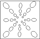
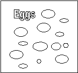
This brings me to my last organizational scheme. Don't know what to call it, but it is simply laying things out where they feel good. Returning to our hypothetical child, one without a mathematic mind, he or she would simply arrange things till they looked good. Based on color, based on size, or randomly -makes no never mind. If it looks good -if it feels right -it's done.
All of the above was written while I was wearing my designer's hat. Permit me to put on my teacher's hat now and come at the problem from a whole different direction -that of information organization or information theory. This is a fascinating -if obscure idea that works to find ways to help people understand. Attractive is nice, but the real purpose is to teach / understand. I'd have to say that there is a lot of stuff in print out there that would benefit from some information theory far more then it would benefit from more art director.
If you have ever found yourself trying to understand a train time-table, some chart or graphic, the fault may be with the design. If it's printed, it probably is "attractive" -visually balanced, color coordinated, well type-set and all, but what the *##% is it saying? -when does the &#!@ train come? -how much does the #&&'ing thing actually cost? This is bad information graphics.
Now to apply this all to collecting -we are forced to recognize that the collector is -frankly- obsessive to some degree about his or her collection. Nothing wrong with this -to a point. If the collector goes beyond this point, (if only in the view of the spouse) -he or she may find they have an obsessive need to communicate the importance of their collection. This takes us back to one of the purposes of a Riker mount -and this entire site for that matter -how to protect and display a valuable collection. But for some collectors, and for some collections, displaying and collection is only the start. The real need is to perpetuate and proselytize. This is to say -the real need is to teach.
So here is my advice for the really committed collector. End with Riker mounts if your collection is appropriate for the same, but begin with some careful thought and perhaps a little research. Google "information theory" and "graphic organization." You will get a lot of useless stuff about making software, but there is also some compelling advice on how to make things understandable.
Think carefully about your collection. Do you have interesting ideas or theories about your collection and the history it represents? Can it be more understandable if you arrange it in a particular way? When a good teacher prepares a lesson -he or she works very hard to put himself in the mind of the student. How can you communicate something important to a mind beset with hormones? Or how can you communicate with an old mind for that matter.
Have a look at my advice on Sahdow Boxes.
*There is much made of this business of acid-free and there is no doubt that there are some collectibles that deserve such concern. The experts don't entirely agree, but if you are absolutely fanatic on the subject, it might be worthwhile to replace the poly with cotton batting or fill. Both are available in good fabric stores. They sell it to make blankets. I explore this subject in my article A Visit to the Fabric Store.
I also have something to say about it all in a series of articles on PRESERVATION. Note particularly one on Archival Materials, which addresses acid-free materials etc.
© August 2005 Bill Harvey